Begin your collection with 15% off your first publication — Use code: WELCOME15
The Rule of Thirds
The Most Useful Thing I Know About Composition
COMPOSITION & DESIGN
If I could hand every creative person I know exactly one tool and say start here, this will help you more than almost anything else, it would be this: the rule of thirds.
Not because it is the most sophisticated principle in art. Not because following it guarantees a beautiful page. But because it is the one framework that quietly solves more compositional problems than any other, and once you understand it — really understand it, in your hands and not just in your head — you will use it every single time you sit down to make something, even when you don't realize you're using it.
It will become the way you see.
What the Rule of Thirds Actually Means
You may have heard of the rule of thirds in photography — the idea that you divide your frame into a grid of nine equal sections using two horizontal and two vertical lines, and that the most visually interesting placement for your subject is at one of the four points where those lines intersect rather than dead center in the frame.
That is true and useful and worth knowing. But I want to talk about something slightly different: the rule of thirds as it applies not to where things are placed, but to what kind of work the different parts of your composition are doing.
Here is how I think about it.
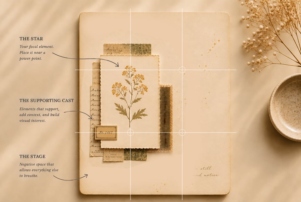
Roughly one third of any composition should be doing the heavy visual work — the focal element, the detail, the thing you most want the eye to find. This is your star. Your anchor. The piece that everything else exists to support and surround.
One third should be supporting it — secondary elements, texture, layers, the quiet conversation happening just behind the focal point. This is the middle ground. Present, contributing, interesting in its own right, but never competing.
And one third should be breathing. Just breathing. Doing nothing except making the other two thirds better by existing quietly beside them. This is your negative space, your margin, your silence. It is as essential as either of the other two thirds, and it is almost always the first thing we sacrifice when our hands get restless.
One third leads. One third supports. One third rests. That's the whole rule.
The Star, the Supporting Cast, and the Stage
I find it helps to think of these three thirds in terms of a theatrical production, because a page and a stage have more in common than you might expect.
Every good production has a star — the element the audience came to see, the thing that carries the emotional weight of the whole. On your journal page, this might be a beautifully aged piece of ephemera, a hand-lettered title, a single botanical illustration, a striking piece of patterned paper. Whatever it is, it should be unmistakably the most important thing on the page. Not because it shouts, but because everything around it is arranged to say: look here.
Then there is the supporting cast — the elements that give the star context, depth, and texture. A wash of color behind the focal piece. A cluster of smaller ephemera that echoes its theme without repeating it. A strip of complementary pattern along one edge. Layers of torn paper that build visual richness without demanding attention. The supporting cast is where a lot of the craft lives. It's where your skill as a collage artist and colorist shows up most clearly, because it requires a particular kind of restraint: being interesting without being distracting.
And then there is the stage itself — the open, unadorned space that makes the whole production possible. A stage without open floor is just a storage room. A page without breathing space is just a surface covered in things. The stage doesn't do anything visible. It simply allows everything else to exist with dignity.
When all three are in balance, the composition feels inevitable. Settled. Like it couldn't have been arranged any other way.
The Power Points: Where Your Star Wants to Live
Here is where the photographic version of the rule of thirds becomes useful again, because where you place your focal third on the page matters enormously.
Divide your page into thirds both horizontally and vertically — two lines going across, two lines going down — and you have four intersection points. These are sometimes called power points, or crash points, and they are where the eye naturally wants to land when it enters a composition.
Place your focal element at or near one of these four points and something almost magical happens: the composition feels balanced without being symmetrical. Dynamic without being chaotic. The eye enters the page, finds the focal point immediately, and then has room to travel through the supporting elements and rest in the quiet third before returning to the star.
Dead center is the least interesting place for a focal element, because it resolves too quickly. The eye lands and stops. There's nowhere to travel because everything radiates outward equally from the middle. It's the compositional equivalent of a room where all the furniture faces the same direction — technically correct, but somehow lifeless.
Off-center is where compositions come alive. Not randomly off-center — intentionally, purposefully off-center, anchored to one of those four natural landing points.
Try it once, deliberately, with your next spread. Place the piece you care most about at the upper left or lower right intersection point. Then build outward from there. See how differently the page behaves.
Is This for the Composition, or Is It for Me?
I mentioned this in the post about negative space, but it bears repeating here because the rule of thirds is where this question becomes most useful.
When I feel the pull toward one more element — one more layer, one more small detail, one more piece that I love and want to include — I try to stop and ask: is this for the composition, or is it for me?
Because sometimes — often — the detail is for me. It's the pleasure of the doing, the satisfaction of the craft, the joy of the particular piece of ephemera I found last Tuesday and have been wanting to use ever since. And that joy is real and valid and not to be dismissed. But it is not a compositional reason.
The rule of thirds gives you a way to answer that question with some objectivity. Ask yourself: does this element belong to the focal third, the supporting third, or the breathing third? If it belongs to the focal third but I already have a strong focal element, adding it will create competition rather than emphasis. If it belongs to the supporting third but that third is already full, adding it will tip the balance toward noise. And if it belongs to the breathing third — well. Nothing belongs to the breathing third. That's the point.
Knowing which third a new element belongs to, and whether that third has room for it, turns a vague feeling of something isn't right into a clear, workable decision.
The Rule of Thirds in Color
The rule of thirds doesn't only apply to the placement and proportion of elements. It applies beautifully to color as well, and this is something I think about constantly when I'm putting together both my pages and my kits.
In a palette built on the rule of thirds, one color is dominant — it covers roughly sixty percent of the composition and establishes the overall feeling. Think of a warm, aged ivory as your foundation, washing over the majority of the page.
A second color is secondary — present in about thirty percent of the composition, supporting and complementing the dominant without overtaking it. Perhaps a dusty sage or a soft ochre, appearing in the patterned papers and layered ephemera.
And a third color is the accent — appearing in only ten percent of the composition, but doing more visual work per square inch than either of the other two. This is the note that makes the chord interesting. A sliver of muted coral. A strip of deep teal. One piece of darker ephemera tucked into the lower corner. Small in area, enormous in effect.
Sixty, thirty, ten. Dominant, secondary, accent. It is the same principle as the compositional thirds — lead, support, rest — translated into color. And it produces the same result: a palette that feels intentional, harmonious, and quietly alive.
This is why my kits are built the way they are. The pieces in each collection aren't just coordinated — they're weighted. There are more of the foundational pieces, fewer of the supporting ones, and just enough of the accent pieces to make the whole thing sing. The rule of thirds is doing its work before you even open the package.
When to Break It
Every rule worth knowing is also worth knowing when to break. The rule of thirds is no exception.
Perfect symmetry — a centered composition with equal weight on all sides — can be extraordinarily powerful when it's used deliberately. Think of a formal portrait, a mandala, a single perfectly centered object given enormous breathing space on all sides. Symmetry communicates stability, ceremony, stillness. Used with intention, it doesn't feel lifeless at all. It feels authoritative.
The difference between symmetry that works and symmetry that deadens a composition is almost always intention. Did you center this because you meant to, or because you hadn't thought about it yet? Did you fill this third because the composition needed it, or because the space made you nervous?
The rule of thirds is most useful not as a law but as a starting point and a diagnostic tool. Start with it. Build from it. Then, if you find yourself wanting to break it, break it on purpose — with your eyes open and a clear reason in mind. A deliberate departure from a rule you understand is a creative decision. An unconscious one is just a habit.
Know the rule well enough to know exactly what you're giving up when you set it aside. Then decide if it's worth it.
A Framework, Not a Formula
I want to close with this, because I think it matters: the rule of thirds is not a recipe. Following it will not automatically produce a beautiful page any more than owning good scissors will automatically make you a skilled cutter.
What it will do is give your instincts a structure to work within. It will give you a language for the feeling that something is off — a way to diagnose a composition that isn't working and understand specifically why. It will give you a reason to protect your breathing space when the urge to fill it arrives, which it always does.
And over time, if you work with it long enough and consciously enough, it will stop feeling like a rule at all. It will just be how you see. You'll look at a page and feel immediately where the weight is wrong, where the eye has nowhere to rest, where the focal element is being crowded out by its well-meaning neighbors.
You'll feel the composition wanting to resolve itself into thirds, and you'll help it get there.
That's when the rule has done its job. Not when you follow it, but when you've internalized it so completely that following it and making something beautiful feel like the same thing.
The kits at Star Phoenix Studio are built with this principle in mind — dominant pieces, supporting pieces, and accent pieces in proportions that do the thirds work for you, so you can focus on the making.
Browse the current collections at starphoenixstudio.com. And the next time a composition isn't working, try asking which third is out of balance. The answer is usually right there, waiting to be seen.
With warmth,
Sandy