Enjoy 15% off your first order · Use code: WELCOME15
The Magic of Neutral:
Why a Quiet Color Palette Makes the Loudest Statement in Your Junk Journal
COLOR THEORY & PALETTES
Sandy Lowdermilk
6/10/20267 min read
There's a moment every junk journaler knows.
You've gathered your papers. You have your ephemera spread across the table, your stamps inked and ready, your favorite washi tape within reach. You start layering — and somewhere around the third or fourth element, something goes wrong. The colors fight each other. The page feels busy and loud and somehow less than the sum of its parts.
You stare at it. You try moving things around. You add more. You take some away.
It still doesn't sing.
Here's what nobody told you at the beginning: the problem probably isn't your eye, your taste, or your skill.
It's your color palette.
Specifically — the lack of a neutral foundation holding everything together.
Let me show you why neutrals are the single most powerful tool in a paper crafter's arsenal, and how building your pages on a quiet, harmonious base will transform everything you make from here on out.
What Exactly IS a Neutral Palette?
When most people hear "neutral," they think beige. Maybe gray. Possibly a sort of sad, colorless existence involving a lot of taupe.
That is not what we're talking about.
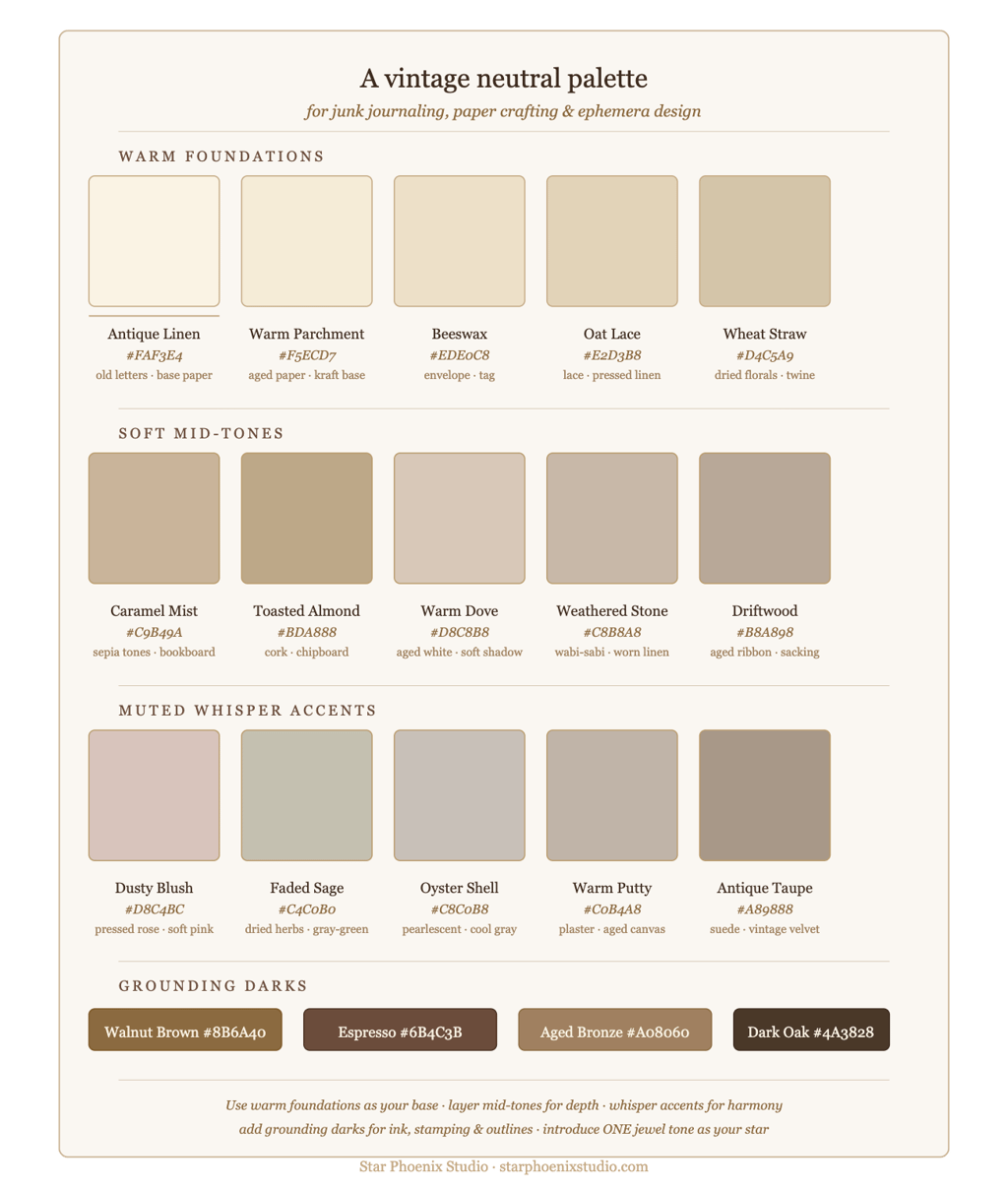
A junk journal neutral palette is a family of soft, harmonious, low-saturation tones that share the same underlying warmth or coolness — and that exist primarily to support the more expressive elements you layer on top of them.
Think:
Warm creams and ivory — the color of old letters and well-loved book pages
Soft taupes and greiges — the color of weathered linen and dried lavender
Muted taupes and warm grays — the color of driftwood and aged stone
Pale blush and dusty rose — barely-there pink with the volume turned all the way down
Antique white and parchment — the color of time itself
Soft sage and eucalyptus — green so quiet it reads almost as gray
Faded sepia and warm brown — the color of tea-stained paper and old photographs
These are not boring colors. These are sophisticated colors. Colors that have lived a little. Colors that have stories.
And together, they create the most versatile, forgiving, endlessly beautiful foundation you can build a journal page on.
The Science of Why Neutrals Work
Here's a little color theory that will change the way you see your craft table forever:
Every strong color needs a resting place — a visual breath — around it to be fully appreciated. When you place a deep burgundy next to a rich teal next to a bright gold, your eye doesn't know where to look. Everything competes. Nothing wins.
But place that same deep burgundy on a page of soft cream and parchment and warm ivory? Suddenly it glows. It becomes the jewel it always was. The neutrals aren't doing nothing — they're doing everything. They're holding space. They're saying look here. This is the important thing.
Interior designers have known this forever. Fashion stylists build entire looks around it. And the greatest art movements in history — from Dutch Golden Age painting to Japanese wabi-sabi aesthetics to Scandinavian design — are built on the profound power of restraint.
Neutrals don't whisper because they have nothing to say. They whisper so that when something speaks, you can actually hear it.
The Junk Journal Case for Going Neutral
Let's get practical, because I know you have scissors in your hand and a craft table calling your name.
Here is why building on a neutral base makes junk journaling easier, more beautiful, and frankly more fun:
Everything coordinates — automatically. This is the big one. When your foundational papers, backgrounds, and base layers all live in the same neutral family, every decorative element you add on top will work with them. You stop asking "does this go?" and start asking "where does this go?" — which is a much more enjoyable creative conversation to be having.
You can mix patterns freely. Stripes, florals, script, toile, damask — patterns that would clash horribly against each other in saturated colors become the best of friends when they share a neutral base. The cream background of a vintage script paper and the ivory background of a floral paper read as the same family even if they're technically different shades, because the eye perceives them as harmonious.
Your focal elements sing. A single deep-colored ephemera piece — a rich teal postage stamp, a burgundy rose, a deep forest green leaf — becomes a star when it lands on a neutral page. You need far less "stuff" to make a page feel complete and intentional. Less clutter. More impact.
Your pages feel cohesive across a whole journal. One of the challenges of junk journaling is making an entire journal feel like it belongs together rather than a random collection of pages. A consistent neutral palette threading through every page — even if the themes and focal colors change — creates that sense of a unified, intentional whole. Like a beautiful book rather than a scrapbook.
It photographs beautifully. If you ever share your work on Pinterest, Instagram, or in a Facebook group — and you should, because your work deserves to be seen — neutral-based pages photograph like a dream. The soft tones don't compete with each other in a photo. They create that dreamy, editorial quality that makes people stop scrolling and lean in.
How to Build a Neutral Foundation: Step by Step
Ready to try it? Here's exactly how to approach your next journal page with a neutral-first mindset.
Step 1 — Choose your base paper. Start with a neutral background — a piece of aged parchment, a cream cardstock, a page from an old book, or a soft kraft paper. This is your canvas. Everything else will be layered on top of it, so keep it quiet and warm.
Step 2 — Add your secondary layer. Tear or cut a second neutral paper — something with a little more texture or pattern, but still in the same warm family. A piece of vintage sheet music in sepia tones. A torn fragment of cream lace paper. A soft floral in muted blush. Glue it down at an angle, letting the base layer show around the edges.
Step 3 — Build your texture in neutrals. Add depth with more neutral layers — a scrap of tissue paper in ivory, a piece of aged script paper, a torn fragment of brown paper bag with beautifully rough edges. Overlap these layers loosely. Ink all the edges with a soft brown or sepia ink pad to unify everything and add that gorgeous aged quality.
This is your garden. You've planted the green things. Now you're ready for the flowers.
Step 4 — Introduce your one statement color. Now — and only now — bring in your color. One ephemera piece in a deeper or more saturated tone. A vintage postcard with a rich blue sky. A botanical print with deep green leaves. A cluster of roses in dusty burgundy. Place it deliberately — slightly off-center, anchored to the page with intention.
Watch what happens. That single color element will feel like it's lit from within against your neutral foundation. That's not magic. That's contrast doing exactly what it was designed to do.
Step 5 — Echo the color in small doses. Now that you've introduced your statement color, echo it in tiny amounts elsewhere on the page — a small washi tape stripe, a stamped word in the same ink color, a single flower tucked into a corner. Three repetitions of a color, distributed unevenly across a page, creates rhythm and intentionality without overwhelming your neutral base.
Step 6 — Add your finishing details in neutrals. Come back to neutral for your finishing touches. A cream ribbon. A natural twine bow. A tag in kraft paper. A white or cream button. These details add texture and interest while keeping the overall harmony intact.
Step back. Look at your page.
There it is.
The Neutral Palette and the Art of Restraint
I want to say something here that I think is worth sitting with:
In a culture that constantly tells us more is more — more color, more decoration, more embellishment, more everything — choosing a neutral palette is quietly radical.
It's a decision to trust restraint. To believe that what you leave out is as important as what you put in. To understand that beauty doesn't have to shout to be heard.
Monet understood this. For all the color in his paintings, his water lily series is built on the most extraordinary restraint — soft greens and blues and grays and whites, with just enough warmth and depth to make the whole thing feel like a dream you almost remember.
The Japanese have a concept called ma — the beauty of empty space, the meaning found in what is not there. Neutral palettes in junk journaling are a kind of ma. The quiet between the notes that makes the music possible.
When you build on a neutral foundation, you're not making less. You're making room for more meaning.
The Star Phoenix Studio Neutral Collections
Every collection I design at Star Phoenix Studio is built around this philosophy. I think about the neutral foundation first — the base papers, the background textures, the quiet supporting elements — before I think about anything else. Because I know that if the foundation is harmonious and warm and beautifully toned, everything you add on top will work.
My Shabby Chic Collection lives almost entirely in the most gorgeous neutral family — creams, ivories, soft blushes, warm grays, and antique whites, with just enough color to make every page feel alive rather than washed out. It's the collection I recommend most often to people who feel overwhelmed by color and want a foundation they can always trust.
The Butterfly & Nature Collection uses warm parchments and sepia tones as its neutral base — earthy, grounded, and natural — with the color coming entirely from the botanical and butterfly elements layered on top.
And the Spring Flowers Collection uses soft sage greens and pale ivories as its resting place, so that the floral elements feel fresh and luminous rather than sugary or overwhelming.
In each case, the neutral foundation is doing the quiet, essential work of making everything else more beautiful.
A Final Word About Playing It Safe
I want to address something you might be thinking: isn't a neutral palette playing it safe? Isn't it a little... boring?
Friend. Look at a Monet. Look at a page from a beautifully made junk journal built on cream and parchment and sepia. Look at a perfectly designed room in soft whites and warm woods with one deep emerald velvet chair.
Does any of that look safe to you?
Neutrals are not the absence of courage. They are the presence of confidence. The confidence to know that beauty doesn't need to compete. The confidence to let one thing be the star. The confidence to trust that less, done with intention, is always more.
That's not playing it safe.
That's mastery.
Now go find your neutrals. Your most beautiful pages are waiting.
Loved this post? Pin it to your junk journal Pinterest boards and share it with a fellow crafter who's ready to fall in love with neutrals. And browse the Star Phoenix Studio collections — every kit is designed with a beautiful neutral foundation built right in.
With warmth,
Sandy
Archival-inspired publications and printable collections celebrating history, craftsmanship, and the timeless art of storytelling.
© 2026 Star Phoenix Studio. All rights reserved Privacy Policy · Terms of Service