Begin your collection with 15% off your first publication — Use code: WELCOME15
Less Is More:
How a Limited Color Palette Brings Peace, Purpose, and Beauty to Everything You Create
COLOR THEORY & PALETTES
Sandy Lowdermilk
6/17/20268 min read
Let me paint you a picture.
You sit down at your craft table with the best of intentions. You have your papers spread out, your ephemera sorted, your stamps at the ready. You're excited. Today is going to be a good creative day.
And then it starts.
Should I use the teal or the burgundy? Maybe both? What about the mustard yellow — that could be interesting. Or the dusty rose. Or actually, what if I went in a completely different direction and used the deep navy? Wait, I haven't tried the sage green yet. Maybe I should start over...
Forty five minutes later you haven't made a single mark. You're staring at a table full of beautiful supplies, completely paralyzed, wondering why something that's supposed to bring you joy feels like a pop quiz you forgot to study for.
Sound familiar?
What you experienced has a name. It's called choice fatigue. And it's one of the most common — and least talked about — creativity killers there is.
The cure is simpler and more beautiful than you might think.
What Is Choice Fatigue — And Why Does It Hit Creatives So Hard?
Choice fatigue is exactly what it sounds like: the mental exhaustion that comes from having too many options. Psychologists call it decision fatigue — the well-documented phenomenon where the quality of our decisions deteriorates the more choices we're forced to make.
You've felt it at the grocery store staring at forty seven varieties of pasta sauce. You've felt it scrolling Netflix for thirty minutes before giving up and watching nothing. You've felt it standing in front of a closet full of clothes thinking you have nothing to wear.
And you've absolutely felt it at your craft table.
Here's why it hits creatives especially hard: we care deeply about our choices. Every color decision feels weighted with meaning. We want our work to be beautiful, intentional, cohesive. We're not just grabbing a pasta sauce — we're making something that reflects our inner world. The stakes feel high.
And when the stakes feel high and the options feel infinite, the brain does what brains do under pressure.
It freezes.
The Radical Freedom of Choosing Less
Here is the paradox that took me years to fully understand — and that I now consider one of the most important creative lessons I've ever learned:
Constraints don't limit creativity. They liberate it.
When you narrow your palette — when you say these three colors, and no others — something extraordinary happens. The agonizing question of what should I use? disappears entirely. In its place arrives something far more interesting: what can I make with what I have?
That shift — from overwhelming possibility to focused exploration — is where real creativity lives.
Think about the poets who choose the sonnet form — fourteen lines, a specific rhyme scheme, a precise meter. Do those constraints make their poems less creative? Of course not. The constraints are the creativity. The limitation forces ingenuity, depth, and beauty that total freedom never could.
A limited color palette works exactly the same way.
When you commit to three colors — or five, or even just a family of neutrals with one accent — you stop making decisions and start making art.
The 10-Minute Color Planning Ritual That Changes Everything
I want to share something personal here, because I think it might change the way you approach every creative project you ever do.
Whether I'm designing a new kit collection, painting a canvas, or sitting down to create a beaded necklace, I have learned — sometimes the hard way — to do one thing before I touch a single supply:
I spend ten minutes developing my color scheme first.
Just ten minutes. Before the scissors come out, before the paint is mixed, before the first bead is strung. I sit quietly with my materials and I make one decision: what colors am I working with today?
I choose my palette — usually three to five colors that feel harmonious and right for the mood I want to create. I pull those colors out and set everything else aside. Sometimes physically put it in a different room if I have to. Out of sight, out of mind, out of the decision-making process entirely.
And then I begin.
What happens next still delights me every time. Instead of spending my creative session paralyzed by options, I spend it creating. The work flows. The decisions are smaller and faster because the big decision — the color story — is already made. I'm not choosing between teal and burgundy anymore. I've already decided. Now I'm just playing.
Ten minutes of planning at the beginning saves hours of confusion, frustration, and abandoned projects later.
It is, without question, one of the best creative habits I have ever developed.
How to Choose Your Limited Palette
So how do you actually do it? How do you narrow the infinite rainbow down to the handful of colors that will carry your project?
Here are the approaches that work best for me:
Start with a feeling, not a color. Before you look at a single swatch or paper or bead, ask yourself: how do I want this to feel? Romantic and dreamy? Earthy and grounded? Fresh and alive? Moody and atmospheric? Warm and nostalgic? The feeling comes first. The colors follow naturally from it. You'll find that certain colors suggest themselves immediately once you know the emotional territory you're working in.
Choose one anchor color. This is your dominant color — the one that will appear most frequently and carry the most visual weight. Everything else will be chosen in relationship to this anchor. It might be a warm cream, a deep teal, a soft dusty rose. Whatever it is, it's the soul of your palette.
Add one or two supporting colors. These live alongside your anchor color — close enough to be harmonious, different enough to be interesting. Analogous colors (neighbors on the color wheel) create gentle, cohesive palettes. Complementary colors (opposites on the color wheel, used in very unequal proportions) create palettes with a little more tension and life.
Add one neutral. Almost every limited palette benefits from at least one neutral — a cream, a warm gray, a soft tan — that gives the eye somewhere to rest between the more active colors. Think of it as the pause between musical notes.
Test before you commit. Lay your chosen papers, fabrics, or materials side by side. Live with them for a moment. Does something feel off? Trust that feeling and swap one element out. The palette should feel like a sigh of relief — not a compromise.
The Rule of Three — Nature's Favorite Palette
If you want the simplest possible starting point for a limited palette, start here:
Three colors. That's it.
Designers, artists, and photographers have known for centuries that three is the magic number for color. Not two — that can feel too stark, too simple. Not four or five — that starts to feel busy again. Three colors, chosen with intention, create a palette that feels complete, dynamic, and deeply satisfying to the eye.
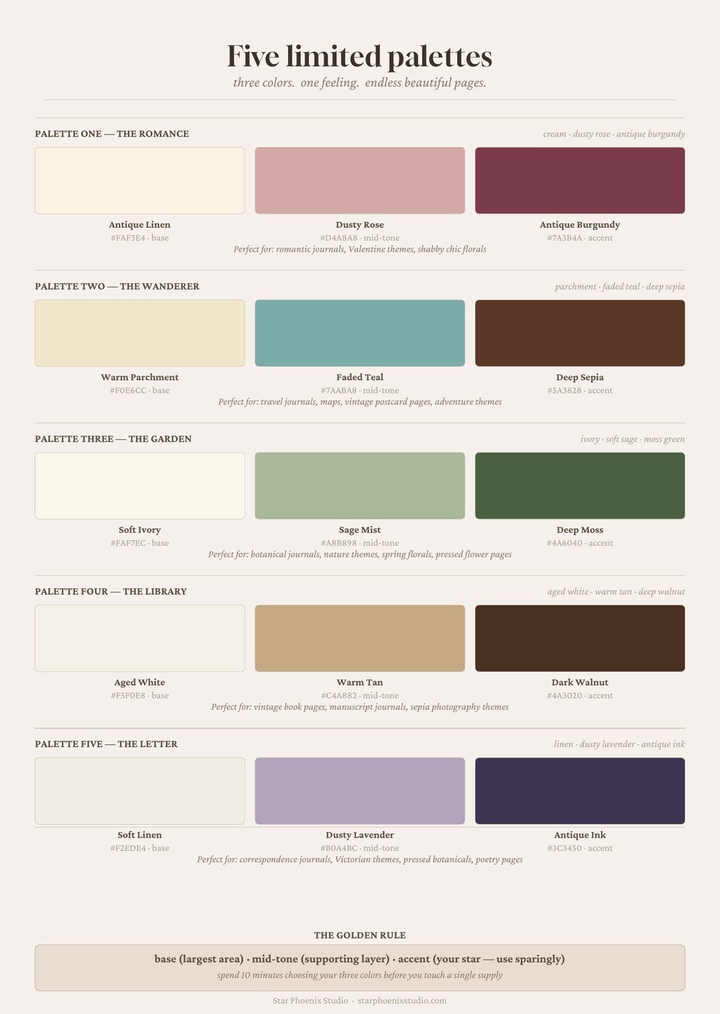
For junk journaling and paper crafting specifically, the most beautiful three-color palettes often follow this simple structure:
One warm neutral (cream, ivory, soft tan, warm white)
One soft mid-tone (dusty rose, sage green, muted blue, warm taupe)
One deeper accent (burgundy, forest green, navy, deep teal, rich brown)
That's a complete palette. That's everything you need to make pages that feel cohesive, sophisticated, and endlessly beautiful.
Everything else is optional.
Less Color, More Meaning
Here's something I find genuinely moving about limited palettes — and it goes beyond the practical benefits of reduced decision fatigue and easier coordination.
When you use fewer colors, each one carries more weight. Each one means something.
Think about the way a single red poppy in a field of green stops your heart. If the whole field were red poppies, you'd feel nothing in particular — just red, everywhere, overwhelming. But one poppy? One poppy is a poem.
That's what a limited palette does to your creative work. It turns each color choice into a statement. The single deep burgundy rose on a page of soft creams and warm ivories isn't just a color — it's a focal point, an emotion, a breath held and released.
You made that happen by choosing less.
The Japanese concept of wabi-sabi — finding beauty in imperfection, simplicity, and restraint — has something to teach us here. The tea ceremony. The raked gravel garden. The single branch of cherry blossom in a plain ceramic vase. These things are beautiful not in spite of their simplicity, but because of it.
Restraint is a creative act. Choosing less is a form of generosity to the viewer — including the most important viewer of your work, which is you.
The Limited Palette in Practice: A Junk Journal Page Walkthrough
Let me walk you through exactly how a limited palette transforms a junk journal page from chaotic to cohesive.
Before — no palette plan: You pull papers in teal, burgundy, mustard, sage, blush, and navy. You add ephemera in multiple colors. You use four different ink colors. The page has energy but no direction. It feels busy. Restless. Hard to look at for long.
After — three color palette: You choose cream, dusty rose, and deep burgundy. You pull only papers in those families — soft ivory backgrounds, muted rose florals, sepia script. Your ephemera is chosen to stay within the palette. Your ink is one color: soft brown. Your washi tape is cream with a blush pattern.
The page breathes. Every element belongs. The eye moves through it easily, landing on the deep burgundy focal piece like finding a jewel. You made it in half the time with twice the satisfaction.
Same skill level. Same supplies. Completely different result — because of the ten minutes you spent choosing your palette before you began.
Building a Signature Style Through Consistent Palettes
Here's a beautiful bonus that comes from working with limited palettes consistently over time:
You develop a signature style.
When you return again and again to the same color families — the ones that feel most deeply right to you, the ones that express your specific creative soul — your work begins to look unmistakably like yours. Not because you're repeating yourself, but because you're speaking in your own color language.
Monet had a color language. Vermeer had a color language. Every great designer, artist, and maker who has ever developed a recognizable aesthetic got there the same way — by making choices, sticking with them, and letting those choices deepen into something personal and true over time.
Your limited palette isn't just a practical tool. It's the beginning of your signature.
And the most wonderful thing about signatures? Nobody else has yours.
The Star Phoenix Studio Philosophy — Beauty Through Intention
This — all of this — is the philosophy baked into every kit I design at Star Phoenix Studio.
Every collection begins with a palette decision. I choose the color story first, before a single paper is designed. I ask: what feeling am I creating? What colors carry that feeling? What neutral foundation will support it?
And then I design every paper, every ephemera piece, every tag and pocket and journal card within that palette. So that when you open a Star Phoenix Studio kit, the palette decision has already been made for you. The ten minutes of planning is already done.
All you have to do is create.
That's my gift to you — the freedom that comes from beautiful, intentional constraint. A limited palette, lovingly chosen, so that your creative session can be exactly what it's supposed to be.
Joyful. Flowing. Peaceful.
Exactly like it was always meant to feel.
Your Creative Invitation
Before your next creative session — whether you're making a junk journal page, painting a canvas, designing a beaded necklace, or arranging flowers — try this:
Sit down before you touch a single supply. Give yourself ten quiet minutes. Choose three colors. Pull only those colors out. Put everything else away.
Then begin.
Notice what happens to your creative session. Notice how the decisions get smaller and faster. Notice how the work flows instead of stutters. Notice how the finished piece has a coherence and a calm that feels different from what you usually make.
That's not luck. That's the magic of less.
Three colors. Ten minutes. One beautiful thing.
That's all it takes.
Did this post resonate with you? Save it to your Pinterest boards for the next time you sit down to create — and browse the Star Phoenix Studio collections, where every kit comes with a beautifully curated, limited palette already built in. Your most peaceful creative session is waiting.
With warmth,
Sandy