Begin your collection with 15% off your first publication — Use code: WELCOME15
Leave It Alone
Learning to Love the Empty Space on the Page
COMPOSITION & DESIGN
6/24/20265 min read
I have a confession to make, and I suspect some of you are going to recognize yourselves in it.
I am constitutionally incapable of leaving well enough alone.
If I draw a leaf, I draw the veins. If I draw the veins, I draw the dew drop on the tip of the central one. If I draw the dew drop, I add the tiny reflected light inside it. Meanwhile, the grass beneath the leaf needs every single blade accounted for, and the sky above it deserves at least a suggestion of clouds, and wouldn't a small beetle on the stem add a wonderful sense of life and scale…
And then I step back and the page is exhausting.
Not beautiful. Not rich. Not detailed in the way I intended. Just… exhausting. Full in the way a room is full when nothing has a place to breathe. The eye lands somewhere and immediately wants to leave because there is nowhere comfortable to rest, no quietness to settle into, no silence between the notes.
This is what too much detail does. It doesn't add richness. It cancels it out.
What Negative Space Actually Is
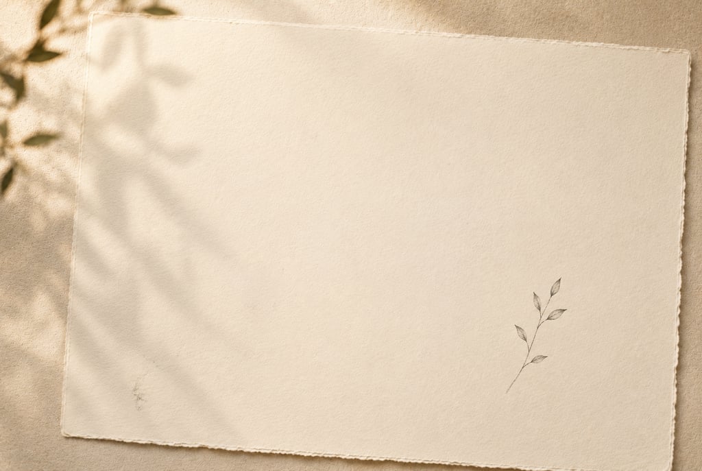
Negative space is the part of the page you leave alone. The unmarked area. The breathing room. The deliberate, intentional nothing.
I want to dwell on that word deliberate for a moment, because this is where most of us go wrong. We treat empty space as the absence of a decision — as the part of the page we haven't gotten to yet, the part that will eventually be filled in. We feel vaguely guilty about it, as though we owe the paper more than we've given it.
But negative space is not emptiness. It is a choice. It is, in fact, one of the most powerful compositional choices you can make, because it does something that no amount of detail ever can: it tells the eye where to look.
Think about it this way. If everything on the page is equally detailed, equally busy, equally insistent, then nothing is more important than anything else. The eye wanders because it has no guide. But when you leave a generous area of quiet — a sweep of unadorned paper, a wide margin, a deliberate pause — suddenly the detailed elements nearby become focal points. They are interesting precisely because they are surrounded by calm.
The detail earns its place. The space makes that possible.
What Monet Knew About Silence
I think about Monet whenever I catch myself reaching for more. Not the water lilies themselves — though those are extraordinary — but the water between them.
He didn't paint every ripple. He didn't account for every reflection. He left vast areas of the canvas in states of suggestion, of almost, of not-quite-resolved. And those areas — the ones where he held back — are as much the painting as the lilies themselves. Maybe more.
The space between the lilies is where the light lives. It's where your eye rests before it travels to the next bloom. It's where the painting breathes.
I wrote about what Monet taught me in an earlier post — about chasing feeling rather than photographic accuracy, about the difference between recording something and interpreting it. Negative space is part of that same philosophy. You are not obligated to render everything you see. You are only obligated to render what matters.
Everything else? Leave it alone.
The Journal Page That Needs Room to Be Written In
There is also a deeply practical reason to make peace with negative space, and it is this: you are making a journal.
A journal is not a gallery piece. It is not meant to be looked at from a respectful distance while you fold your hands. It is meant to be written in, lived in, carried around, pressed with flowers and receipts and the occasional coffee ring. It is meant to hold words.
If every inch of the page is covered, where do the words go?
I have filled pages so completely — in my early, enthusiastic, more-is-more phase — that I couldn't bring myself to write on them. They felt finished in a way that excluded me from my own journal. Which is, when you think about it, a fairly spectacular failure for an object whose entire purpose is to invite you in.
Negative space on a journal page is not wasted space. It is the space where the journal does its actual work. It is the field where your handwriting gets to be beautiful, where a date or a line of poetry or a single overheard sentence gets to float with dignity instead of fighting for territory.
Design the space for the words before you place the first element. Protect it the way you'd protect the best seat in the room — deliberately, in advance, without apology.
How to Actually Do It (When Every Instinct Says Otherwise)
I know. Easier said than done. Especially for those of us who find joy in the dew drop, the blade of grass, the beetle on the stem. The detail is not wrong. The impulse toward it is not a flaw. It just needs direction.
Here is what has helped me.
Before I place a single element, I decide where the negative space will be and I treat it as sacred. Not "I'll leave some room over here" but a real, committed decision: this area of the page will remain quiet. I sometimes lightly mark it in pencil — just a soft boundary — so that when the urge to fill it inevitably arrives, I have something to remind me of the promise I made to the page.
I also think in thirds. Roughly one third of any composition should be doing the heavy visual work — the focal element, the detail, the thing you most want the eye to find. One third should be supporting it — secondary elements, texture, layers. And one third should be breathing. Just breathing. Doing nothing except making the other two thirds better by existing quietly beside them.
And when I feel the pull toward the dew drop, toward one more blade of grass, one more small perfect detail, I ask myself: is this for the composition, or is it for me? Because sometimes — often — the detail is for me. It's the pleasure of the doing, not the need of the page. And that's worth knowing, even if the answer doesn't always stop my hand.
The Space Is Part of the Art
The hardest thing to accept, for those of us who love detail the way I do, is that restraint is not the opposite of creativity. It is one of its highest expressions.
Anyone can fill a page. It takes a particular kind of discipline — and a particular kind of trust — to leave part of it open. To say: I know what could go here, and I am choosing not to put it there. To believe that the empty area is earning its keep even though you can't point to what it's doing.
But you can feel what it's doing. You feel it the moment you step back from a composition that has room in it. There's a settling. A rightness. The eye moves through the page instead of bouncing off it. The detailed elements glow a little brighter because they have silence around them.
That is the negative space working. That is the nothing doing everything.
Leave some of the page alone. Not because you ran out of ideas, but because you had enough of them to know when to stop.
Every kit I design has this principle built into it — pieces that are meant to anchor, pieces that are meant to support, and enough open page left over for the journal to be a journal. The composition is already thinking about your words, even before you are.
Browse the current collections at starphoenixstudio.com — and the next time you sit down to work, try protecting one quiet corner of the page before you begin. See what happens to everything around it.
With warmth, Sandy